Choosing a Book Orientation: Portrait vs Landscape vs Square
estimated reading time: 5 minutes
What is the Orientation of a Book?
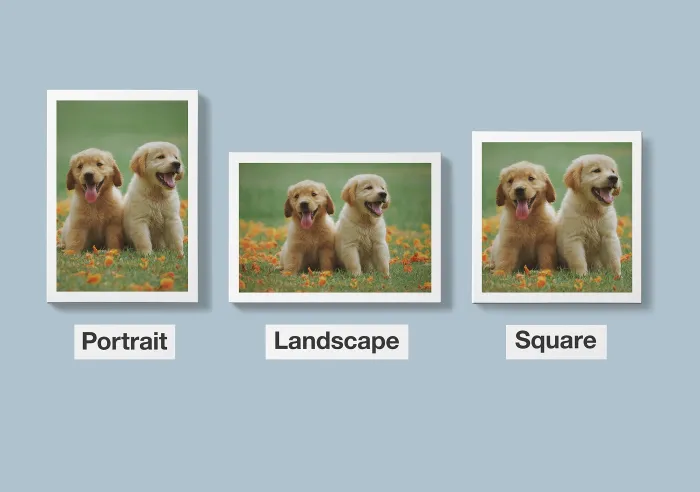
The Orientation of a book refers to the proportional relationship
between its width and height dimensions.
For example, a book's width could be shorter than its height
(portrait orientation), a book's height could be shorter than its width
(landscape orientation), or the width and height dimensions could be equal
(square orientation).
Choosing the Best Orientation for your Book
When choosing the best orientation, the decision ultimately
comes down to which format does a better job of presenting the subject matter to
your readers.
In other words, you'll want to choose the orientation that aligns
best with the flow of your book's content while providing the most user-friendly
interaction with the book.
Because the format of a book can significantly impact the
reading experience, it is important to choose an orientation that complements your
specific book. With that in mind, below is an explanation of each orientation type
to help you make an informed decision for your book project.
Portrait Orientation
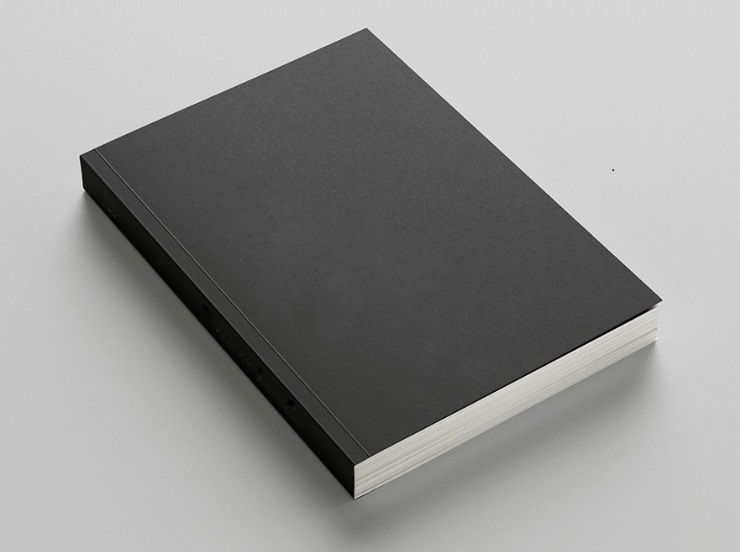
A portrait-oriented book is taller than it is wide. Hence,
the cover and pages are configured vertically. Common examples of portrait book
sizes are 5.5" W x 8.5" H, 6" W x 9" H, 8" W x 10" H, and 8.5" W x 11" H.
Because the portrait aspect provides an appealing look and
function, the vast majority of books are produced with this orientation. In
fact, the portrait orientation is widely considered to be the traditional
format for printed books.
The portrait orientation is immensely popular because it
offers many benefits. For example, it creates pages that have a narrower field of vision, which
increases concentration by making the lines of text shorter and easier to read. This makes the
portrait orientation a perfect fit for text-heavy books. This is why novels,
biographies, manuals, textbooks, poetry books and other narrative-driven books
are commonly printed with a portrait orientation.
Also, the vertical layout of a portrait book allows for a
more traditional reading experience, making it easier for readers to comfortably
hold the book with both hands or with only one hand. The relatively narrow
pages are also easier to navigate and flip through.
Another benefit of portrait-oriented books is that their
proportions allow them to fit neatly into bookcases or rest upon bookshelves.
Because portrait books have such widespread use, most of the
printing and binding equipment used to create books is heavily geared toward this
orientation. The grain direction and dimensions of most paper stocks are also
intended primarily for portrait work. As a result, portrait books are usually
more economical to produce than a landscape or square book.
By the way, you may be wondering why it is called a "Portrait"
orientation. The portrait orientation gets its name from the art of portraiture,
which is a painting, sculpture, photograph, or other artistic representation of
a person. Since portraits historically depict the head and torso of a person, or
even the full body, they are created with the same vertical posture as the person
and are thus taller than they are wide.
Landscape Orientation
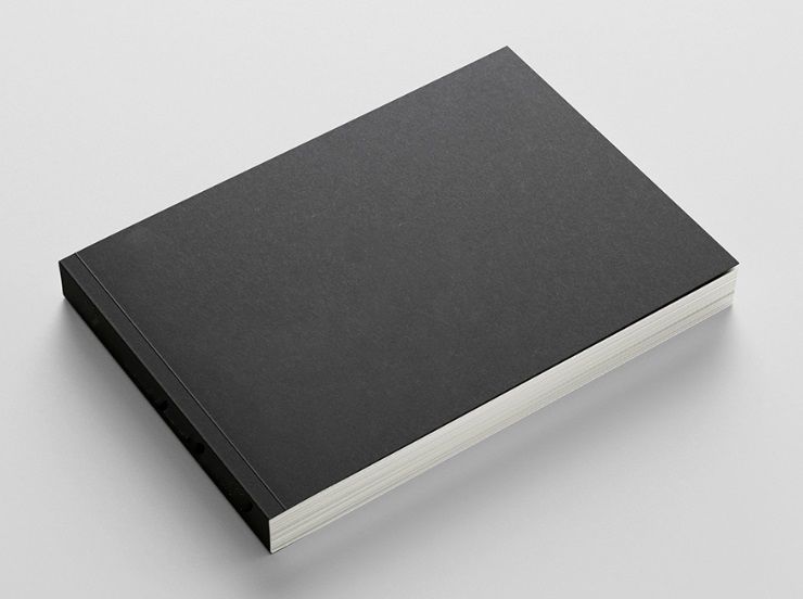
A landscape-oriented book is wider than it is tall. This means
the cover and pages will have a horizontal shape. Common examples of landscape
book sizes are 8.5" W x 5.5" H, 9" W x 6" H, 10" W x 8" H, and 11" W x 8.5" H.
While the portrait orientation remains the predominant
choice for most book projects, the wider pages of the landscape orientation
offer some distinct advantages for certain types of content and genres.
For example, landscape-oriented pages provide the expansive view
needed for books that rely heavily on images and visuals. This includes photography
books, illustrated children's books, picture-dense cookbooks, books that contain
lots of charts, graphs, or diagrams, and any other type of book designed to offer
a visually-engaging experience.
In addition to providing more room for creativity, the
horizontal layout of the pages tends to naturally guide the reader on an
explorative journey through the book. In addition, the larger images make it
easier for the reader to fully immerse themselves into the book's content without
feeling constrained by a narrow page layout. These features are particularly
beneficial to the art of storytelling.
Books with a landscape orientation can also be easily rested
on a table or across one's lap while they are being read. This makes them more
comfortable to hold and manipulate for small children, older adults, and
individuals with dexterity challenges.
Maybe you are curious why is it called a "Landscape" orientation.
A landscape refers to the visible features of an area of land or countryside,
whether we are viewing it with our own eyes or in the form of a painting or photograph.
Since a landscape spans across our view in a horizontal direction, we use the
term landscape orientation to refer to books that are wider
than they are tall.
Square Orientation
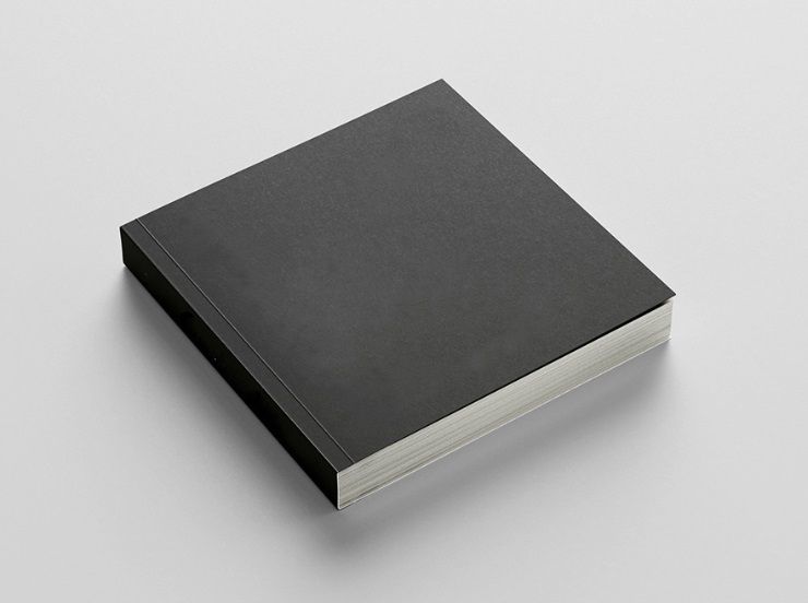
A book with a Square orientation means its width dimension is
the same as its height dimension. In other words, all four sides of the book
are equal in length. Common examples of square book sizes are 6" W x 6" H, 7" W
x 7" H, and 8.5" W x 8.5" H.
Of the three book orientations, the Square format is used
the least. However, this just adds to the uniqueness of a square book and helps
it stand out. As a result, it is gaining in popularity for art books,
photography books, graphic novels and other creative works.
The square orientation strikes a balance between its two
rectangular cousins, portrait and landscape. As a result, the square shape gives
it a sophisticated and contemporary edge, allowing it to capture attention and stand
out against books with a more conventional appearance.
Also, the symmetrical pages work equally well for displaying
text and images. Because the book's flow appears as neither vertical or
horizontal, the reader's eyes are drawn to the center of each page, thus capturing
attention that is highly focused.
Unlike the Portrait and Landscape orientations, the Square orientation
needs no explanation as to how its name was derived. It is simply called "Square"
because all four sides of the book are equal in length.
Do you need help with a Book Project?
Color Vision has been in the commercial printing
business for over four decades. Whichever orientation, size, or binding style
you prefer for your book project, we can create it for you.
Best of all, our printing, finishing, and bindery services
are extremely affordable. So, if you have an upcoming project and would like a
quote, simply fill out our Quote Request form and will email a quote
to you.
Or, if you prefer to discuss your project by phone, just
give us a call at 800-543-6299 and we will be happy to help.
As always, we hope to hear from you soon and
look forward to assisting with your next print project!
Related Articles
Can you Print Perfect Bound Books in Small Quantities?
Read This Article

Cheapest Book Sizes to Print (Save on Printing Costs)
Read This Article

How to Get a Book Printing Quote: Use this Simple Checklist
Read This Article
Commercial Book Printing: What are my Paper Options?
Read This Article